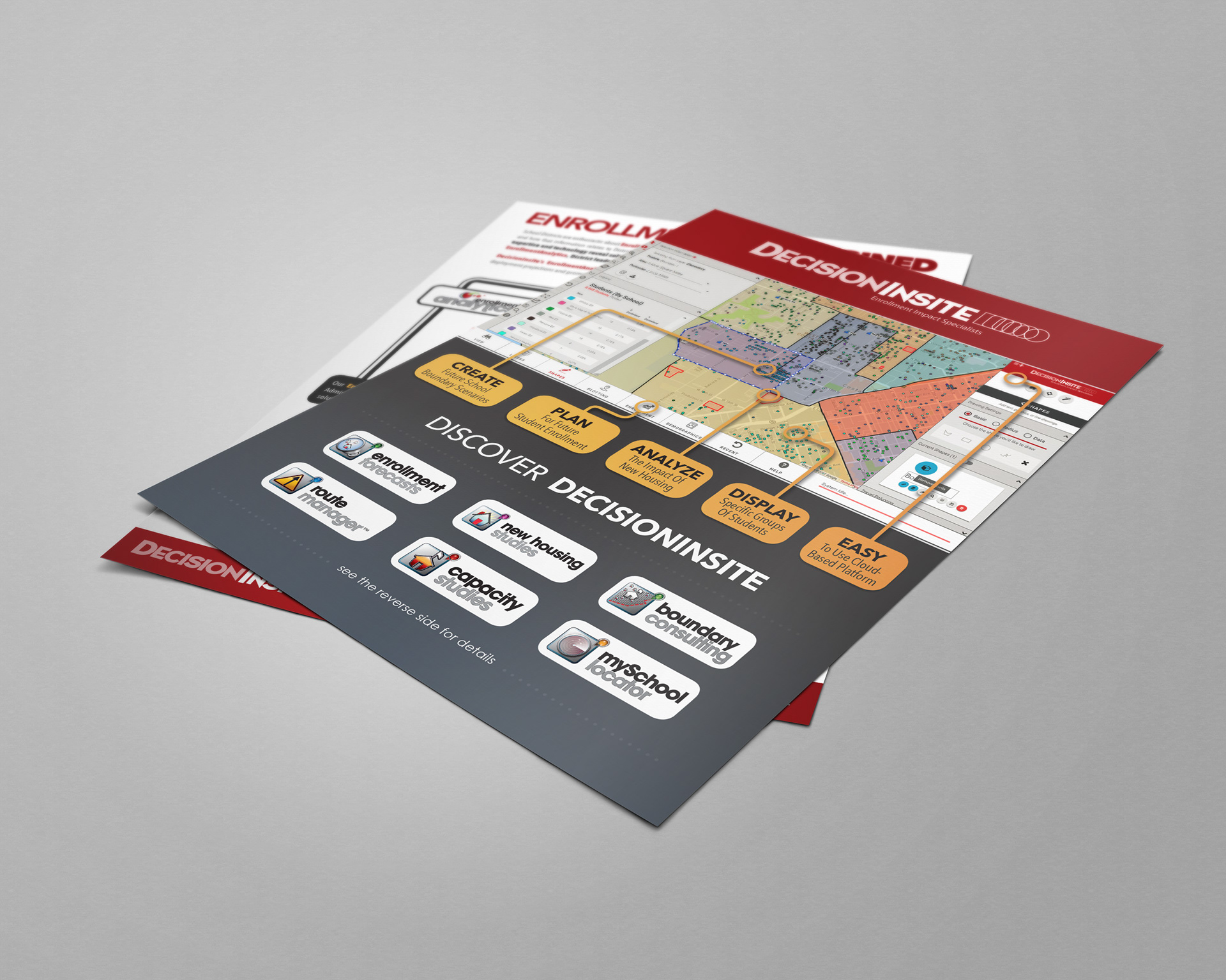
One of the pieces created to help market DI is a one-page, two-sided brochure touting the features and core competencies of a software used by the school districts.
Selected ad concept chosen to help convey the how Decision Insite's software provides multiple solutions to multiple school district problems.
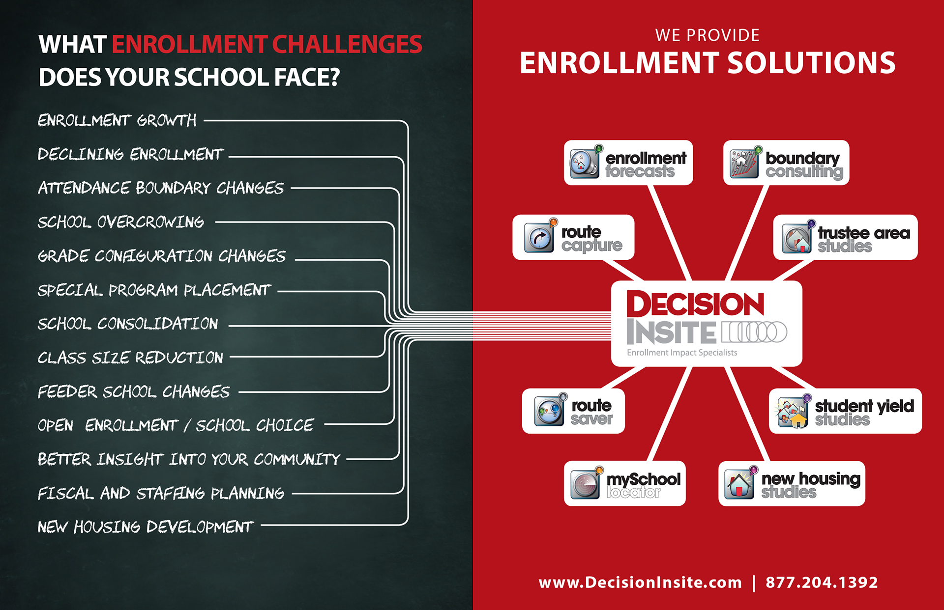
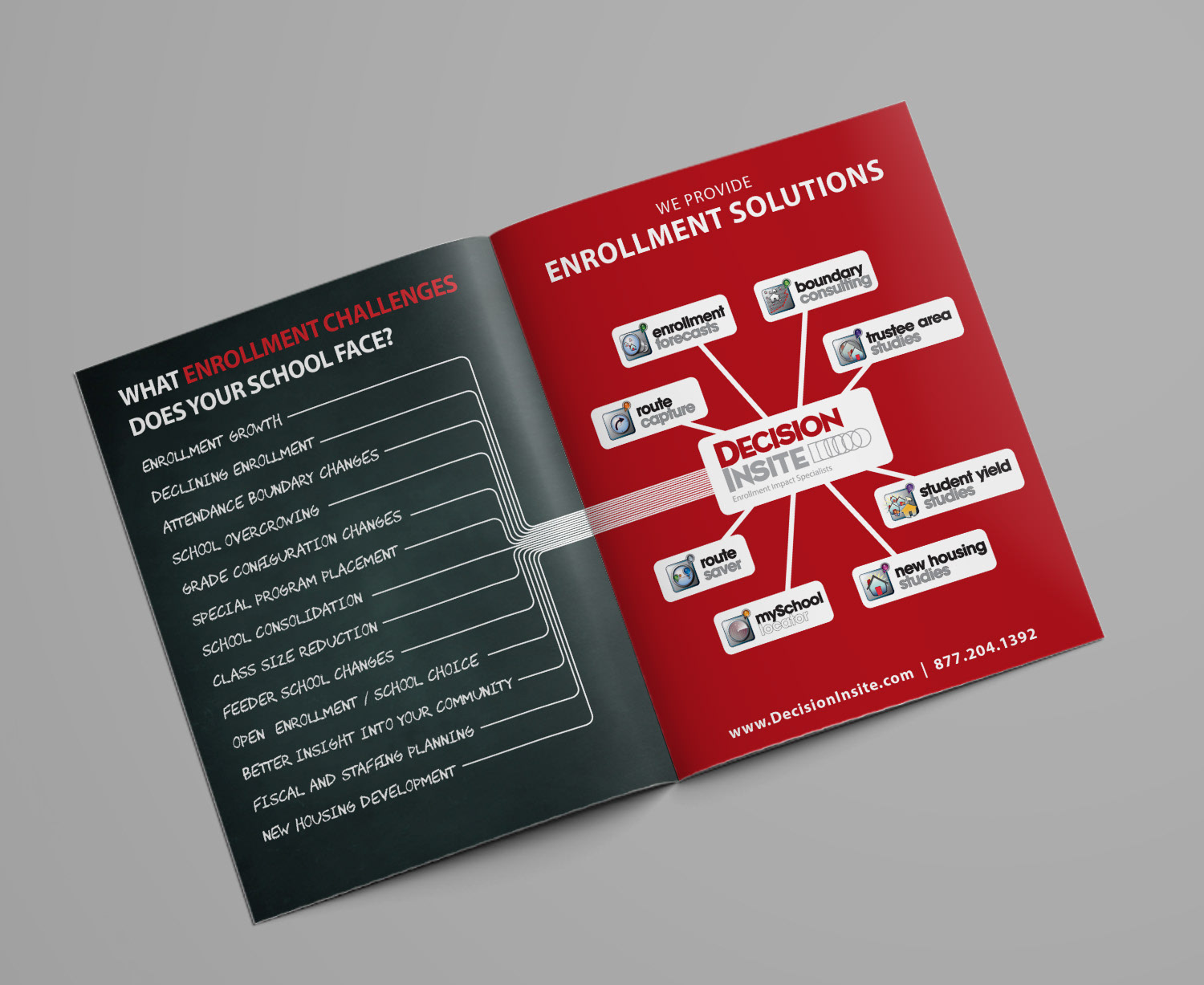
Another chosen ad concept meant to convey the same message of the software providing multiple solutions to multiple school district problems.

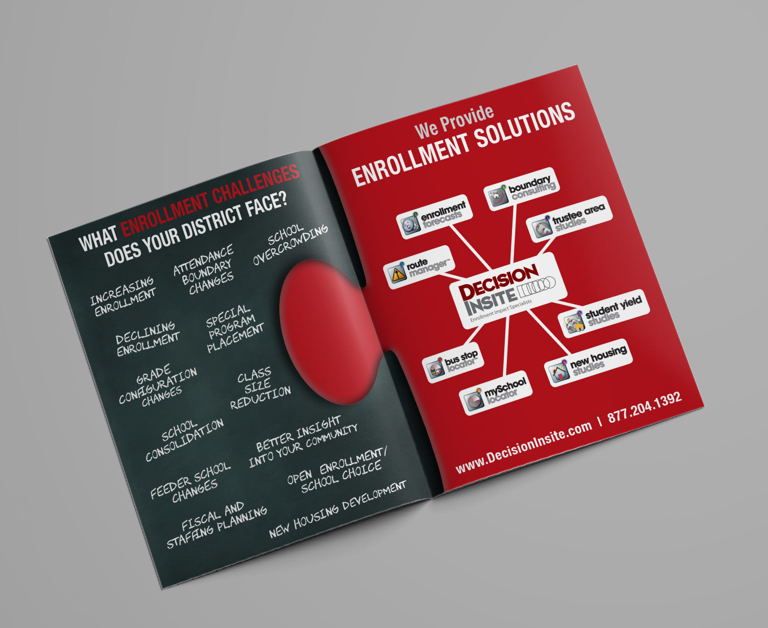
Other ad concepts presented to the client showed the connection between the problems and solutions addressed by the clients software in more abstract and graphic ways.

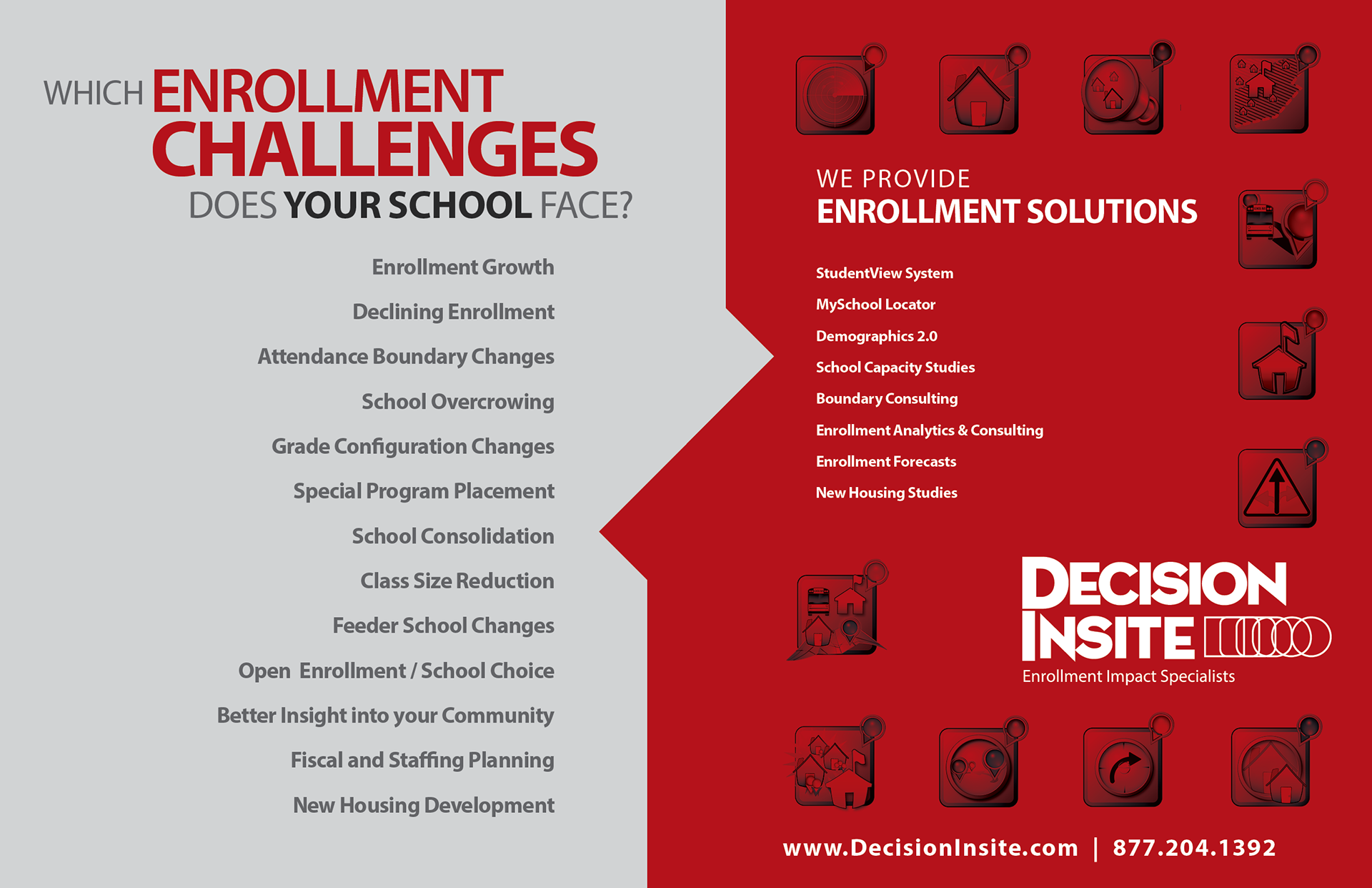
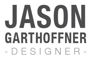
Another brochure concept presented to the client included a modified version of their current brochure, which was updated to have more design happening in the weight and color of the font used. Sectioning off portions of information, in order to make the entire piece more "digestible" than before, was accomplished using bands of color and lines.
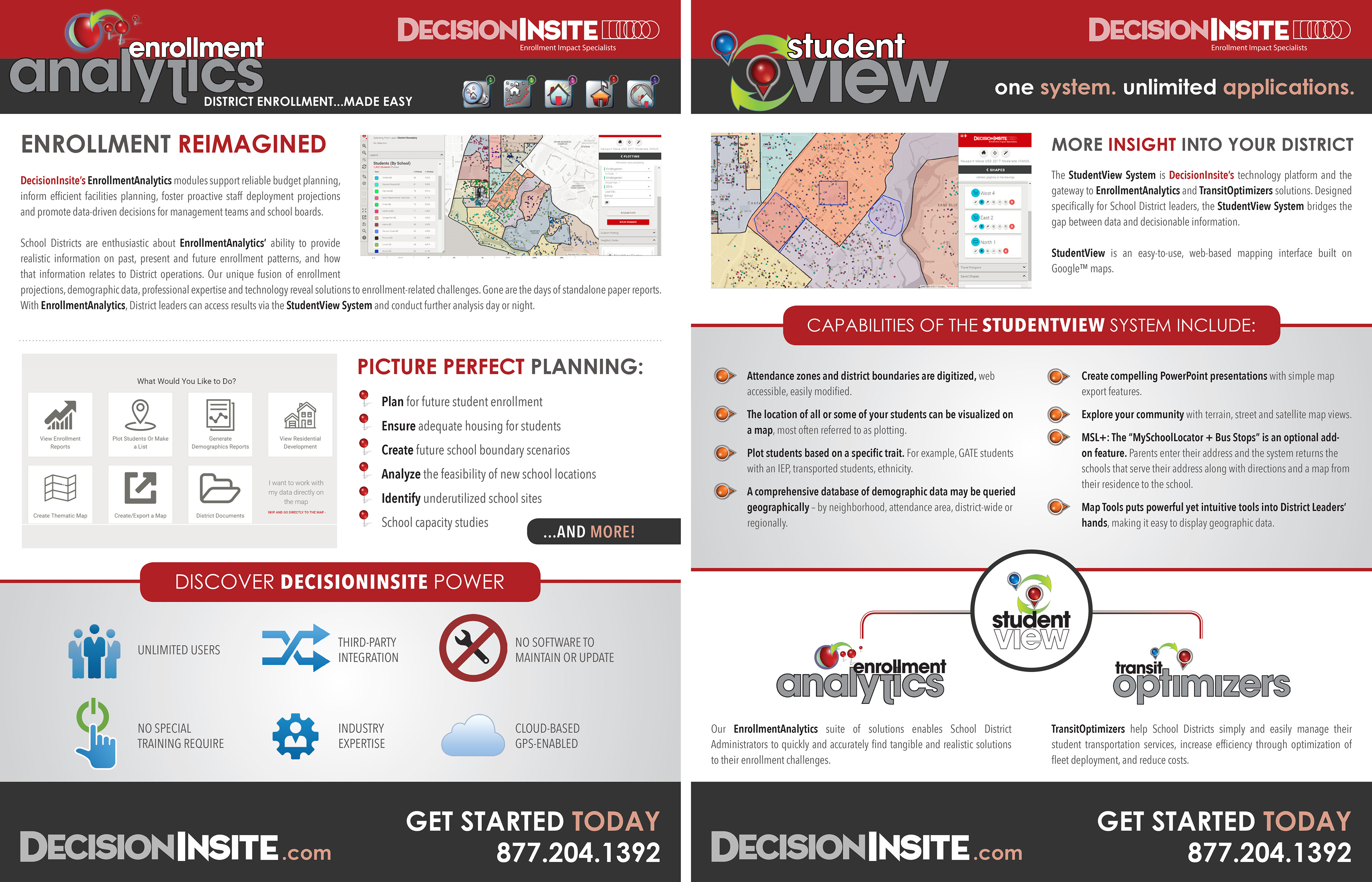
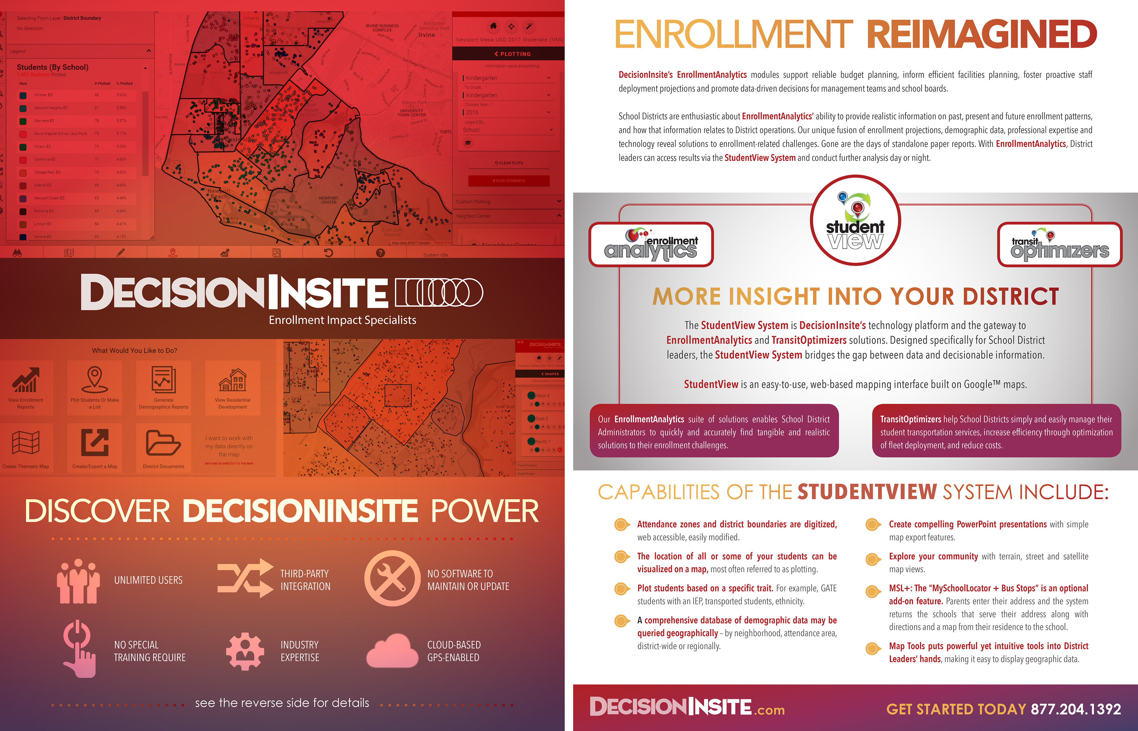
In addition to their more traditional design I proposed a few versions of a different layout that aimed to be a more modern presentation for the brand by employing a more colorful layout and using the screenshots of the software as graphic elements.
The other goal of this direction was to focus the flow of information onto the backside by coming up with a layout that allowed me to consolidate the bulk of the content to one side while attempting to make the front side a more visually striking first impression than the version above.
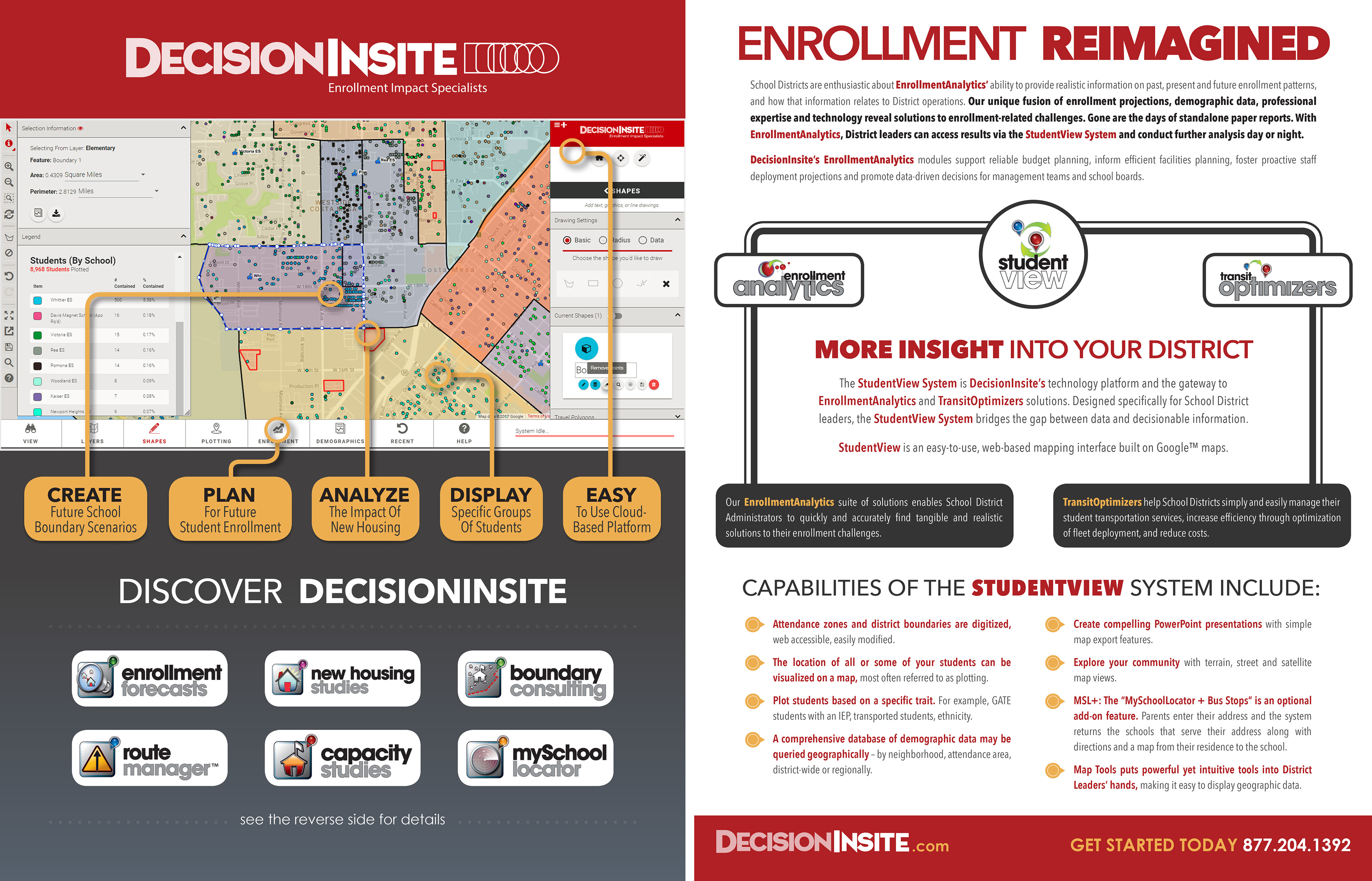
After client input the end result up top was a balance between this direction and the more "traditional" way, which still accomplishes the visual communication goals I had in mind.