My Role: Ideation, Research, Style Guide, Wireframes
Project Timeline: 2 Weeks
Cancer Support Community Redondo Beach serves cancer patients and their caretakers with the stated mission “To ensure that all people impacted by cancer are empowered by knowledge, strengthened by action, and sustained by community.”
Research showed the site would benefit from an update in both look and functionality.
Challenge:
Come up with a website redesign that facilitates both online donations, the user's ability to search and sign up for CSCRB's numerous programs, and have an updated look that helps connect with the user on the type of emotional level necessary to give comfort to the cancer community.
To begin mood materials were gathered for inspiration on color, layout and imagery.

Next was an audit of CSCRB's information architecture, which revealed a number of dead and redundant links.
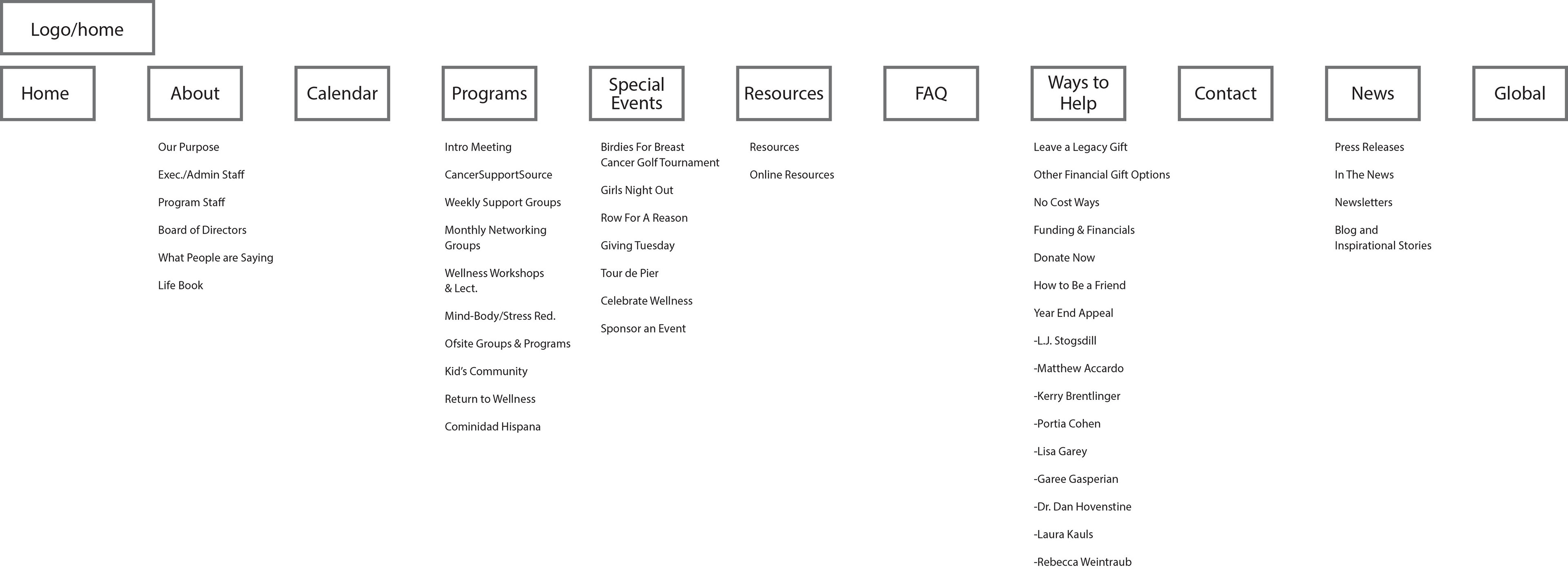
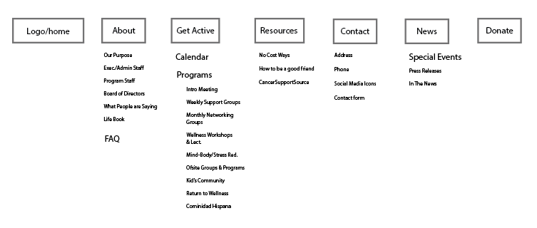
A new sitemap was developed to help streamline/simplify the flow of information and the user's ability to navigate the site.
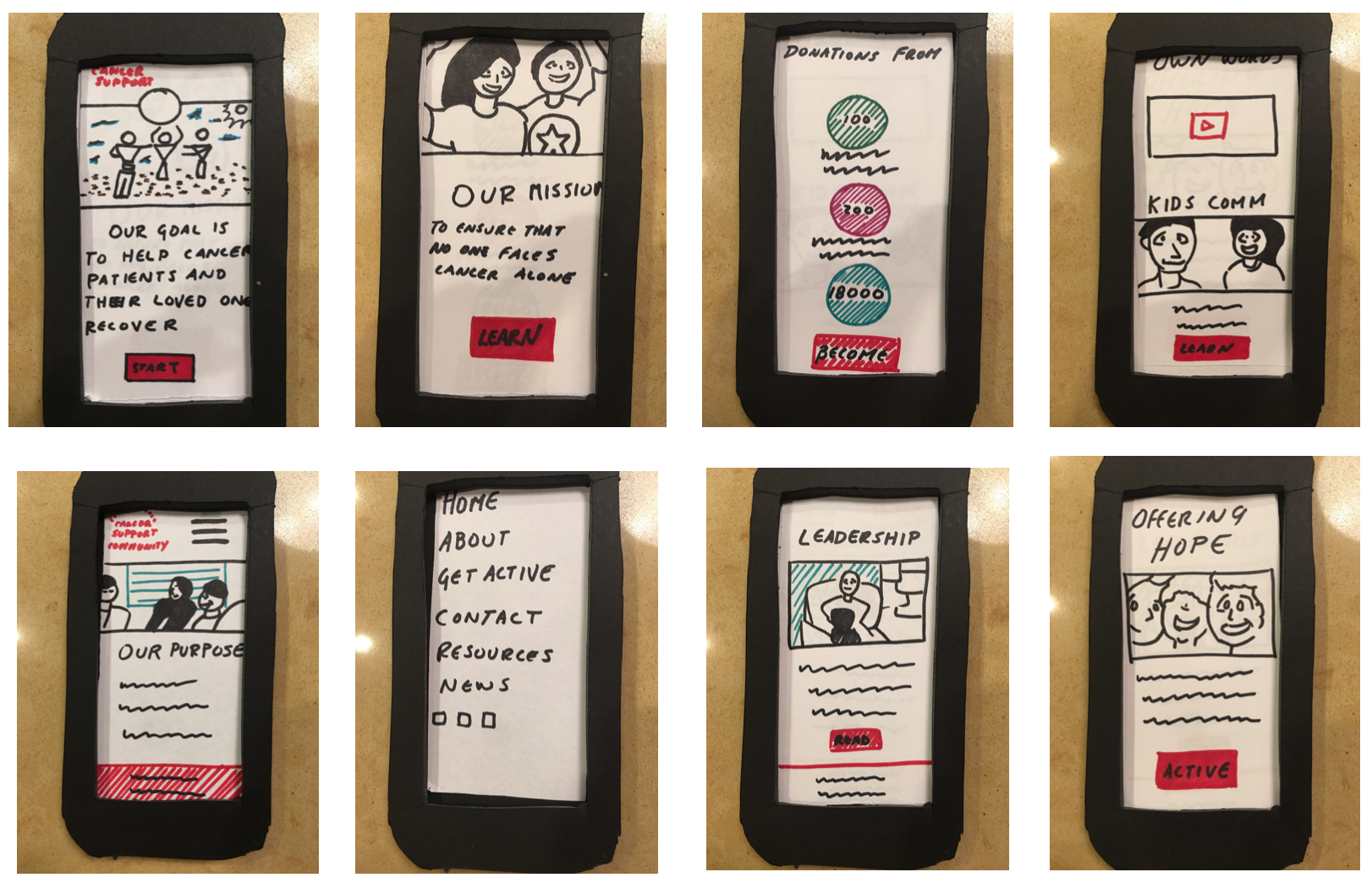
The current CSCRB website is not mobile responsive, so a paper prototype of the mobile responsive layout based on our mood materials was developed.
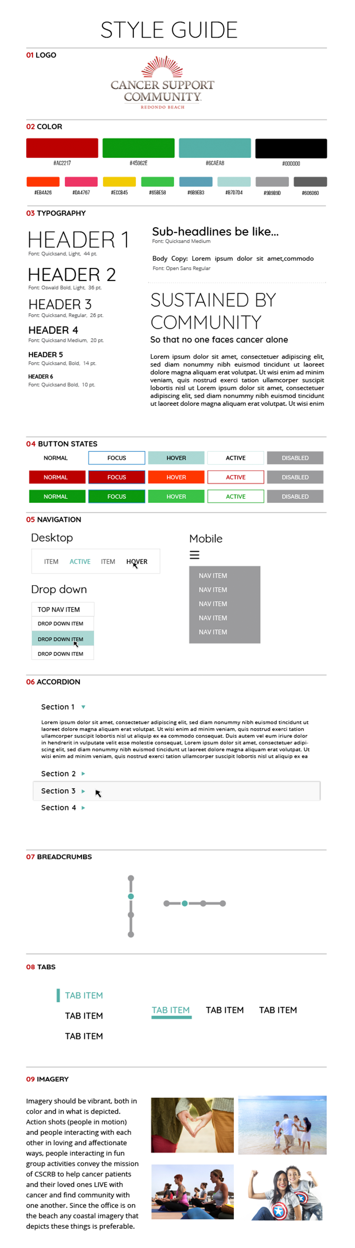
A style guide was created to so the team could be on the same visual page we worked on our parts of the project.
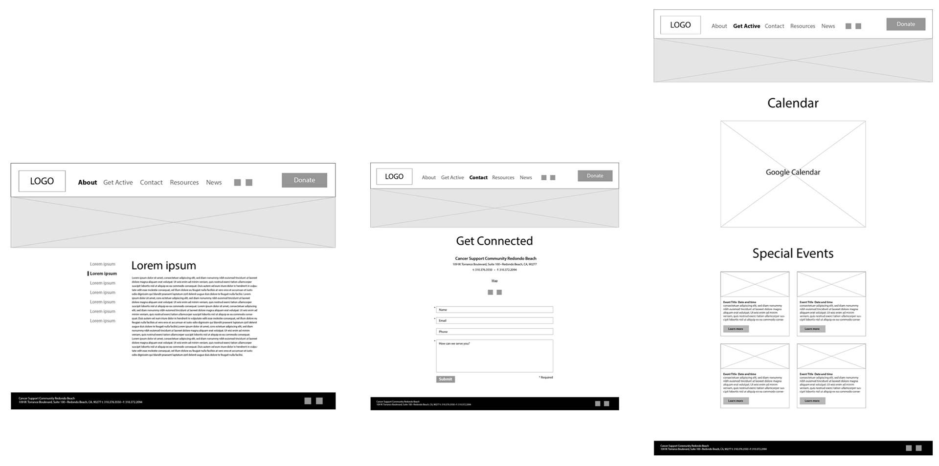
Wireframes for the new desktop version was the final step before the development of the hi-fidelity prototype.
The home page redesign takes elements from the current home page and gives them their own space. Each space has a call to action. The decision to do this was based on the way the home page layout has been segmented, and the idea was to give the user mulitple opportunities to further engage the site and
The first section would have a video background showing cancer patients "in action" as a way to evoke life and inspire hope in those who come to the page.
The nav bar starts at the bottom and becomes fixed to the top of the screen when the user scrolls it to that point. The aim of placing the nav at the bottom of the screen to start is to try to emphasize the liveliness of the video background and call to action to see more.
In addition to the hi-fidelity wireframe the group also developed an animated demo in Flinto of how the home page, donation, and calendar would work:

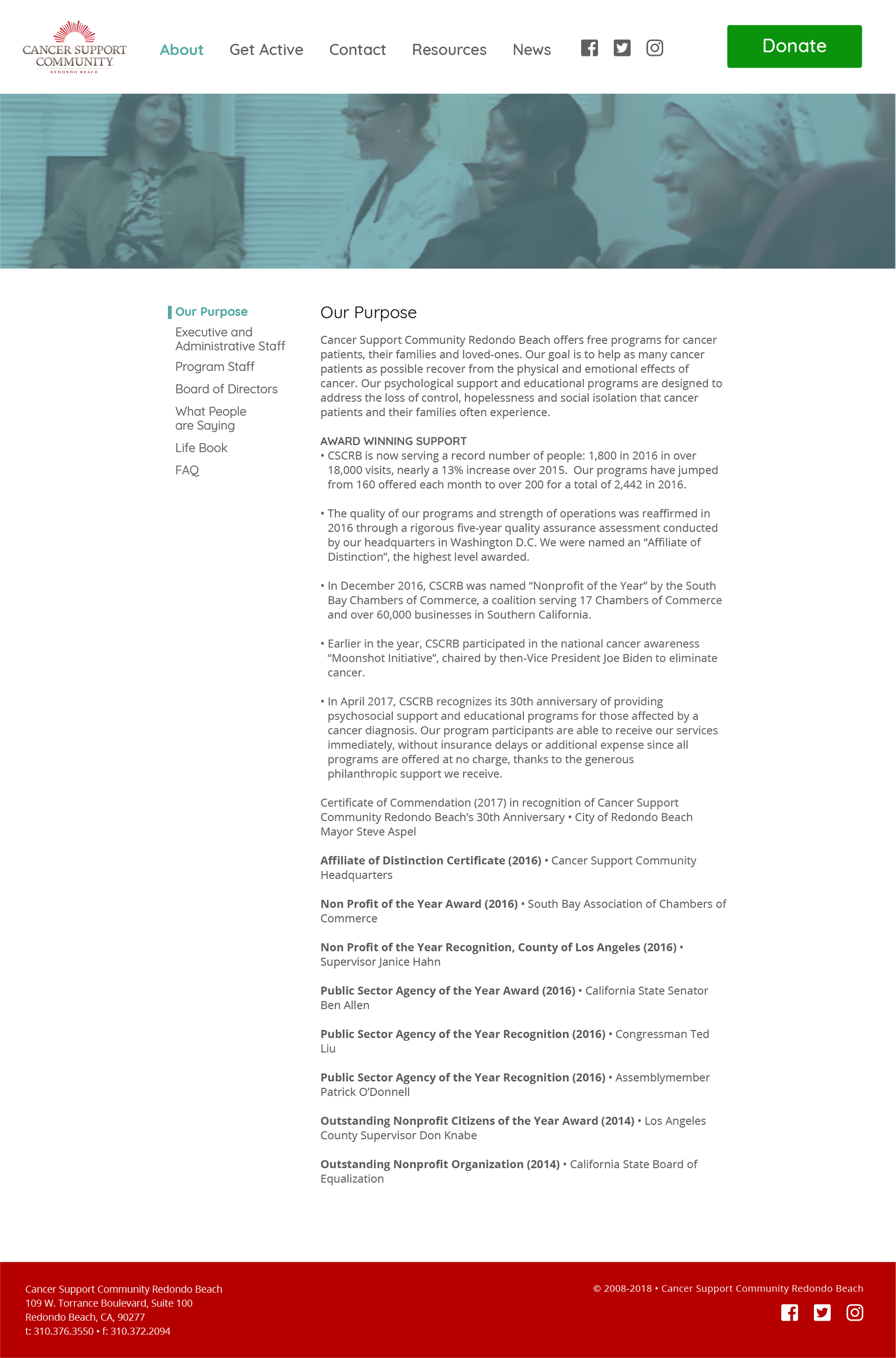
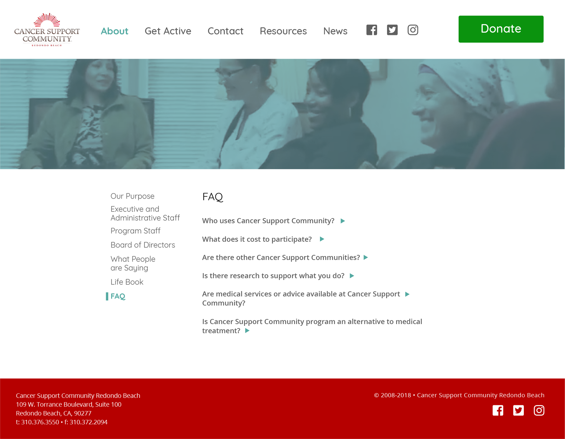
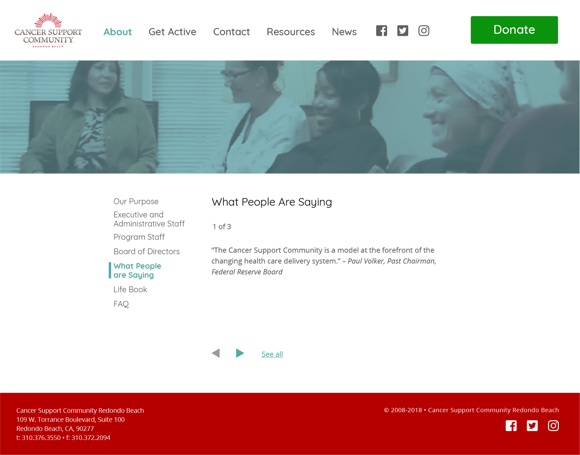
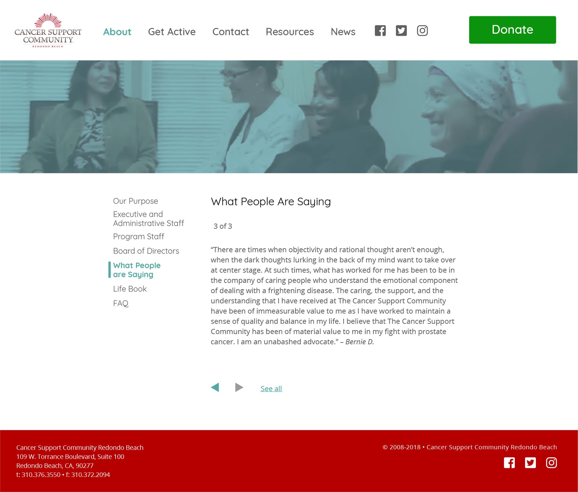
The basic page structure remains consistent throughout most of the site, particularly on the strictly informational pages.

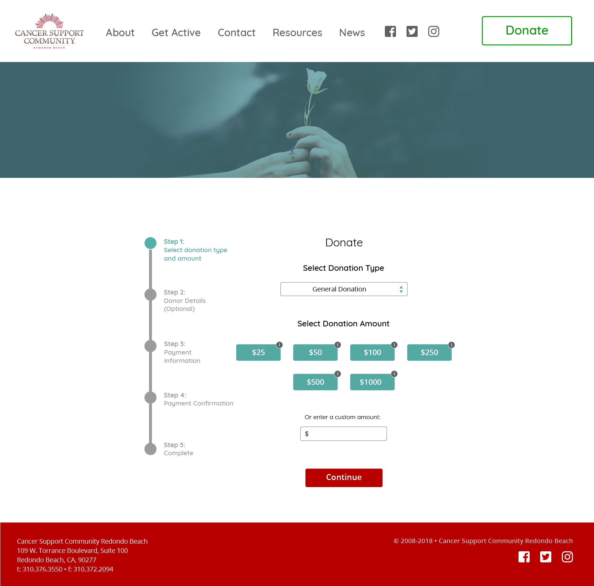
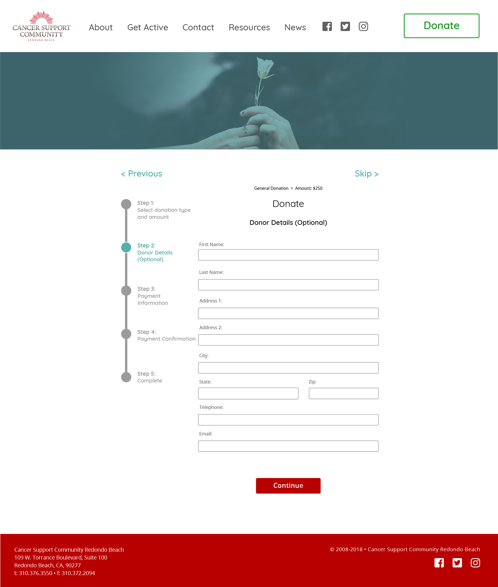
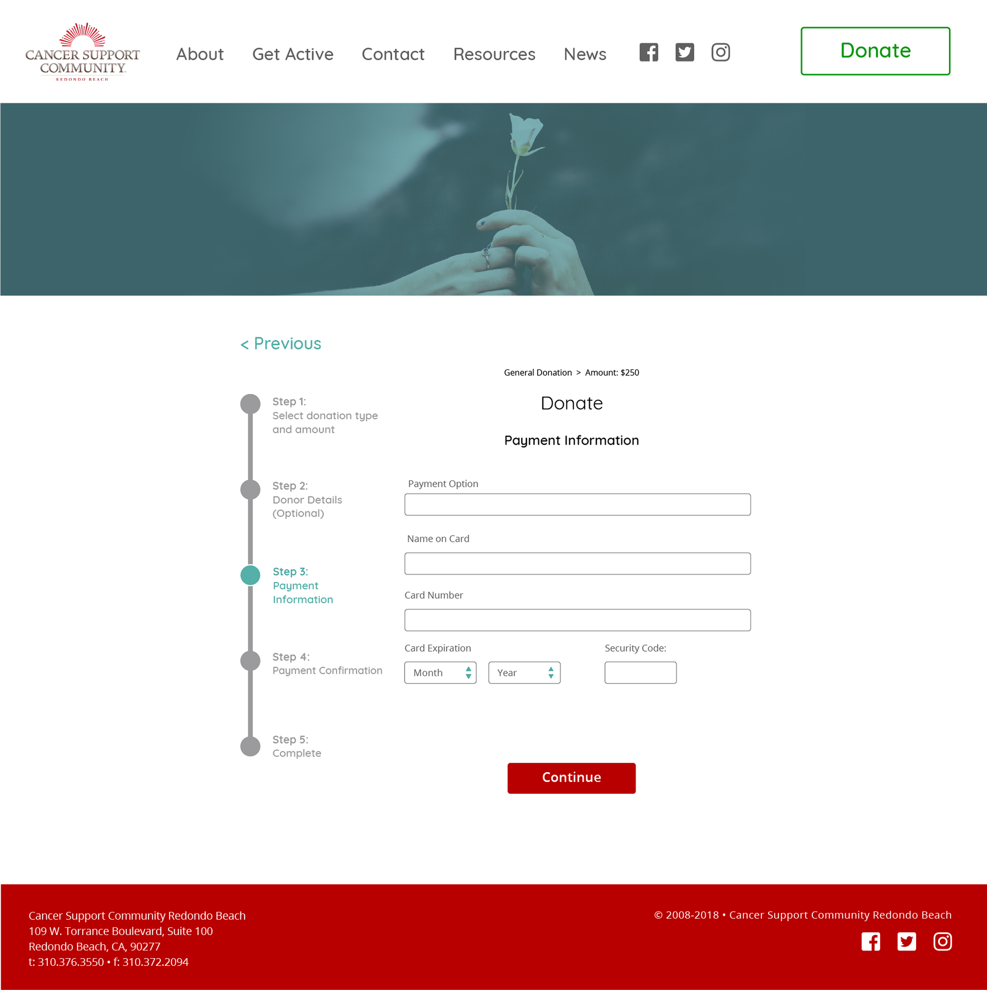
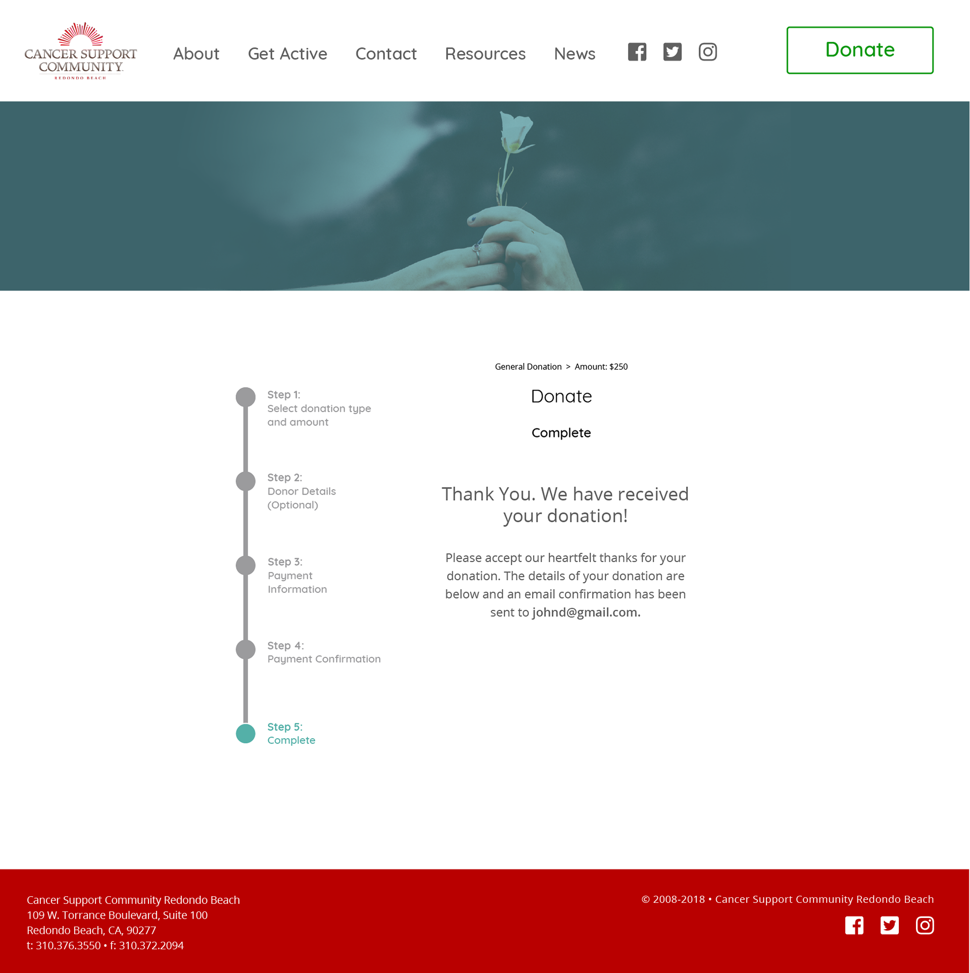
Currently if users wish to donate to CSCRB there are disparate links located throughout the site, the new donation flow is centralized and much easier to locate.

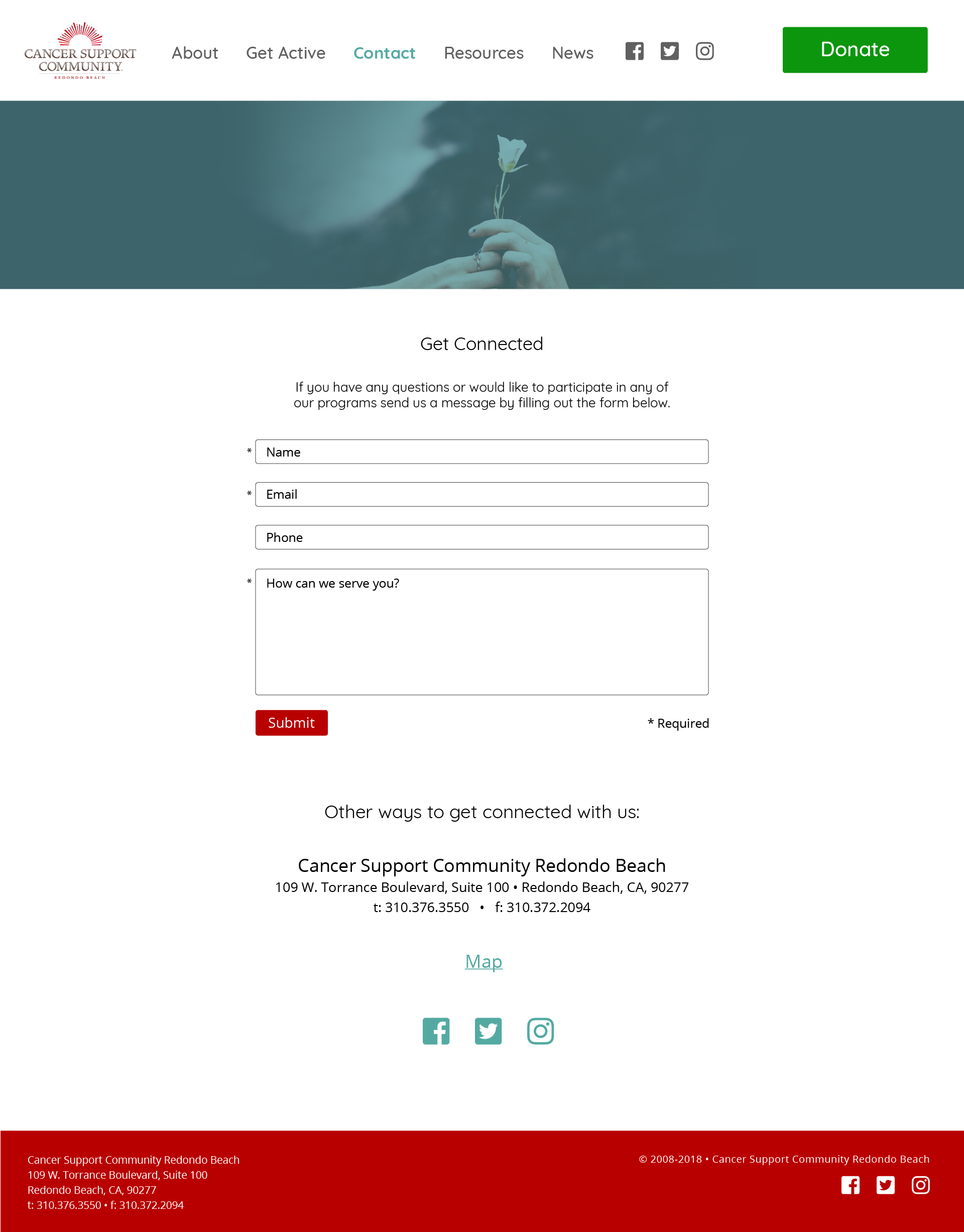
A contact form has been added to give the user greater accessibility to CSCRB. Currently there is just a list of email addresses and phone numbers, those remain as "back ups" to the contact form.
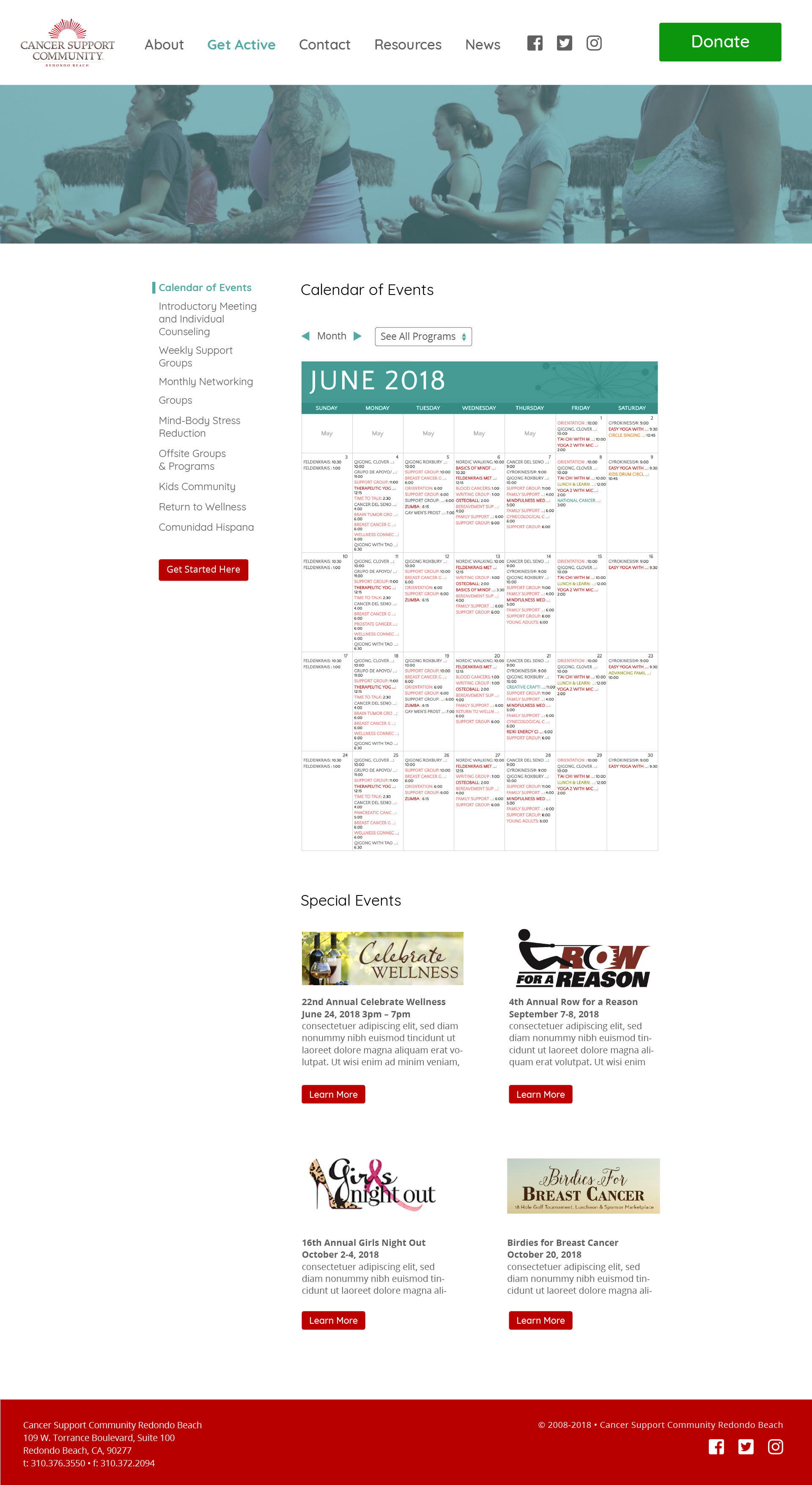
The current calendar of events is an image taken from a pdf of CSCRB's newsletter. The updated calendar below would function dynamically, allowing the user to filter according to events most relevant to their needs, along with the ability to add the event to their calendar.
Lastly, animated prototypes were generated to show exactly how the donation process and calendar function would work.
Users were invited to examine the current website and compare it to the InVision prototype. A survey of their thoughts were taken, and the results showed that users by almost every metric preferred the redesign to the current site.

Comments included:
“It looks more modern. The video with the ocean is calming and optimistic.”
“The Motion and Movement makes the site feel more alive. Color, liveliness, warmth”
“The stats are clearer, the images are cleaner, and the donation button is easy to find.”
“Seems more legit and modern”
Future considerations:
In the short timeframe our group was able to accomplished a great deal. There are a few items we would've wanted to touch on if the opportunity to do so was there:
1. Submitted the design to CSCRB for feedback.
2. Examine survey responses critical of our design over the current website and address issues that were noticed.
3. Consider retooling the survey to be more probative in order to try to understand a couple of things. First why people perceived the homepage appeal, as this was the only metric in which the current site outperformed the redesign. A curious development considering a majority agreed the redesgn was more appealing overall. Second, there was very little feedback (requested or given on why people overwhelmingly chose the redesigned donation and calendar flows.
4. Further usability testing (i.e. heatmapping) to see how (and if) people interact with the calls to action. Specifically the calendar and donation flow.
5. Develop and test a mobile layout beyond the low-fi wireframe phase.
Thank you for viewing this project!