My Role: Ideation, Research, User Journey, Wireframes
Project Timeline: 2 Weeks
Problem
Barnes and Noble has been experienced drops in sales both in store and online for two years Research pointed to leading causes being a failure to compete with Amazon, and a digital platform that simply isn't working for users.
Challenge
Come up with a solution that improves the user experience of Barnes and Noble's digital presence that will also help the book seller become more competitive with Amazon.
Initial research revealed that most people prefered Amazon for both price and ease of use. Compounding this challenge was the fact that Barnes and Noble's mobile app was basically a clone of their mobile responsive site. As a result it experienced very slow load times and crashed often, both of which were chief complaints contributing to the 1.7 out of 5 rating on the iOS app store.
Research also showed that users do like Barnes and Noble as a destination and instant gratification was a chief motivation for purchasing from the store despite their less user-friendly experience and Amazon's better prices.
The app concept the group came up with aimed to accomplish three things:
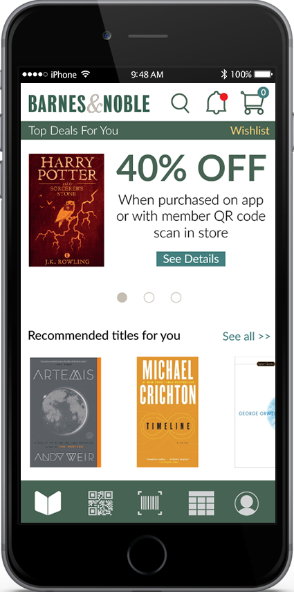
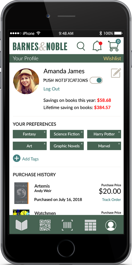
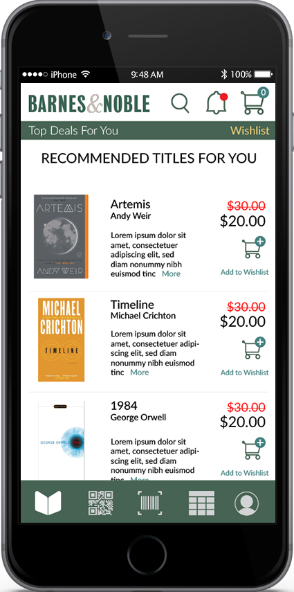
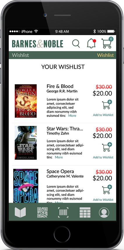
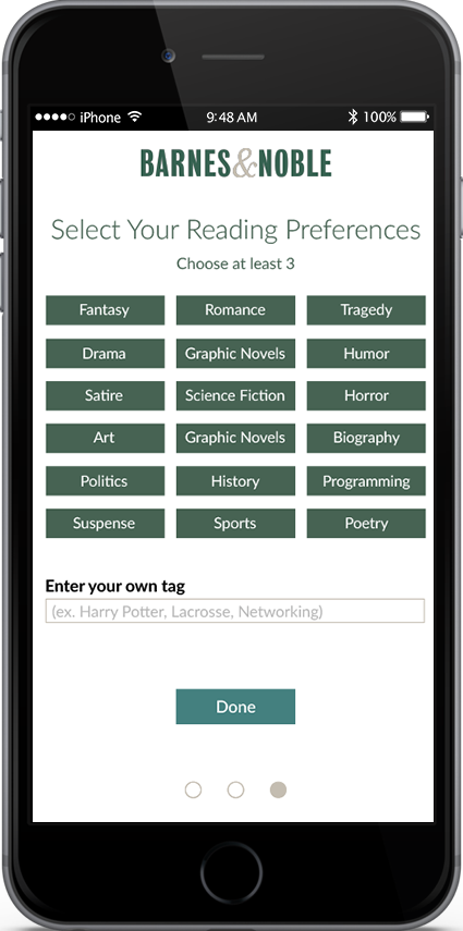
A Simplified and Personalized Experience: Upon registration user is given the opportunity to give information on their reading preferences. App is limited to only showing books the user would be interested in most, based on self-identified preferences and purchase history.
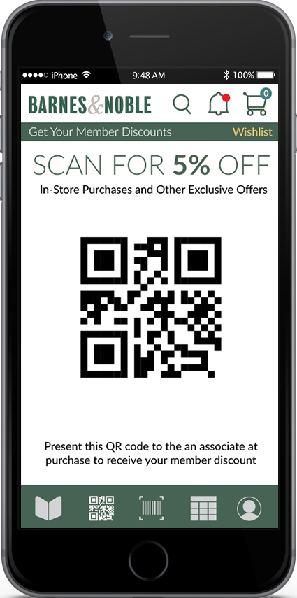
Making Barnes and Noble Price Competitive: Registration for the app makes users eligible for 5% discounts on all purchase in store and online. Other specials exclusive for the user are made available, based on their interests.
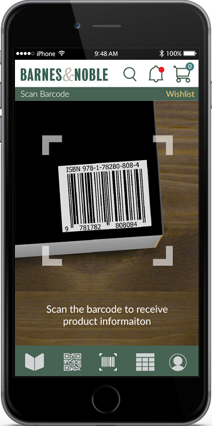
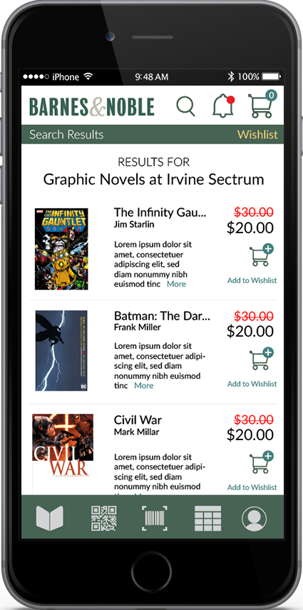
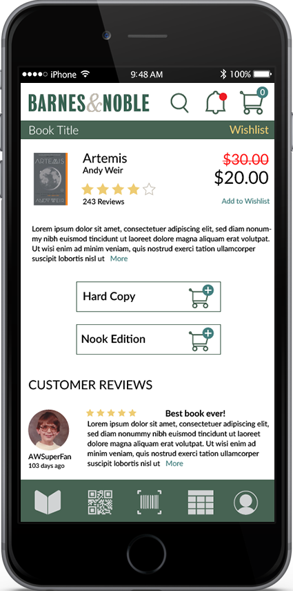
Enhances In-Store Browsing and Searchability: App can be used to scan barcodes to access more information such as what the discounted price would be, user reviews. Using location services users can search for books and get results based on the inventory of the store they are currently in and other locations nearby.
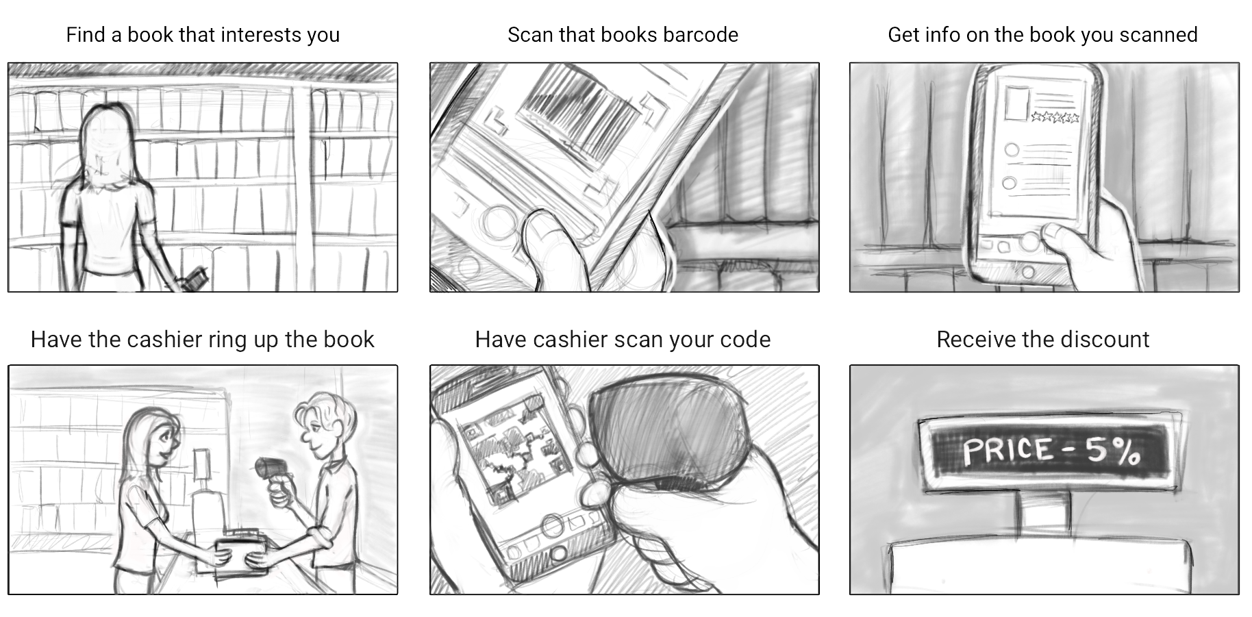
One of the first approaches to this project following the research was to develop a storyboard of how the use of this app would be envisioned.
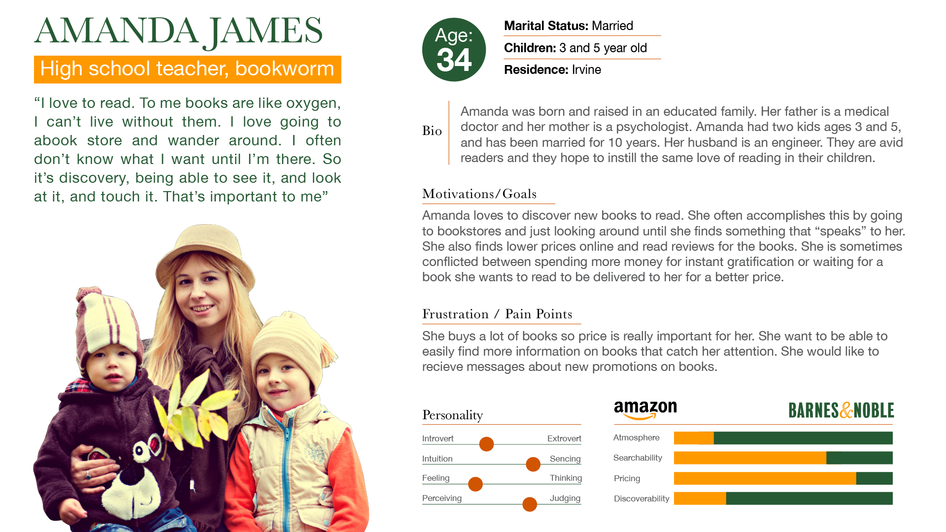
The user persona was crafted as a sort of composite of the Barnes and Noble customers who were interviewed.
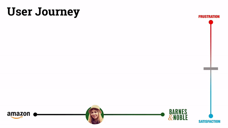
In conjunction with our insights, the storyboard and user persona facilitated creation of the user journey.
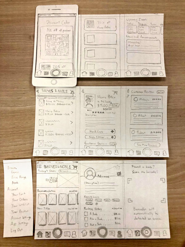
With the storyboard came sketches of the layout and development of a paper prototype.
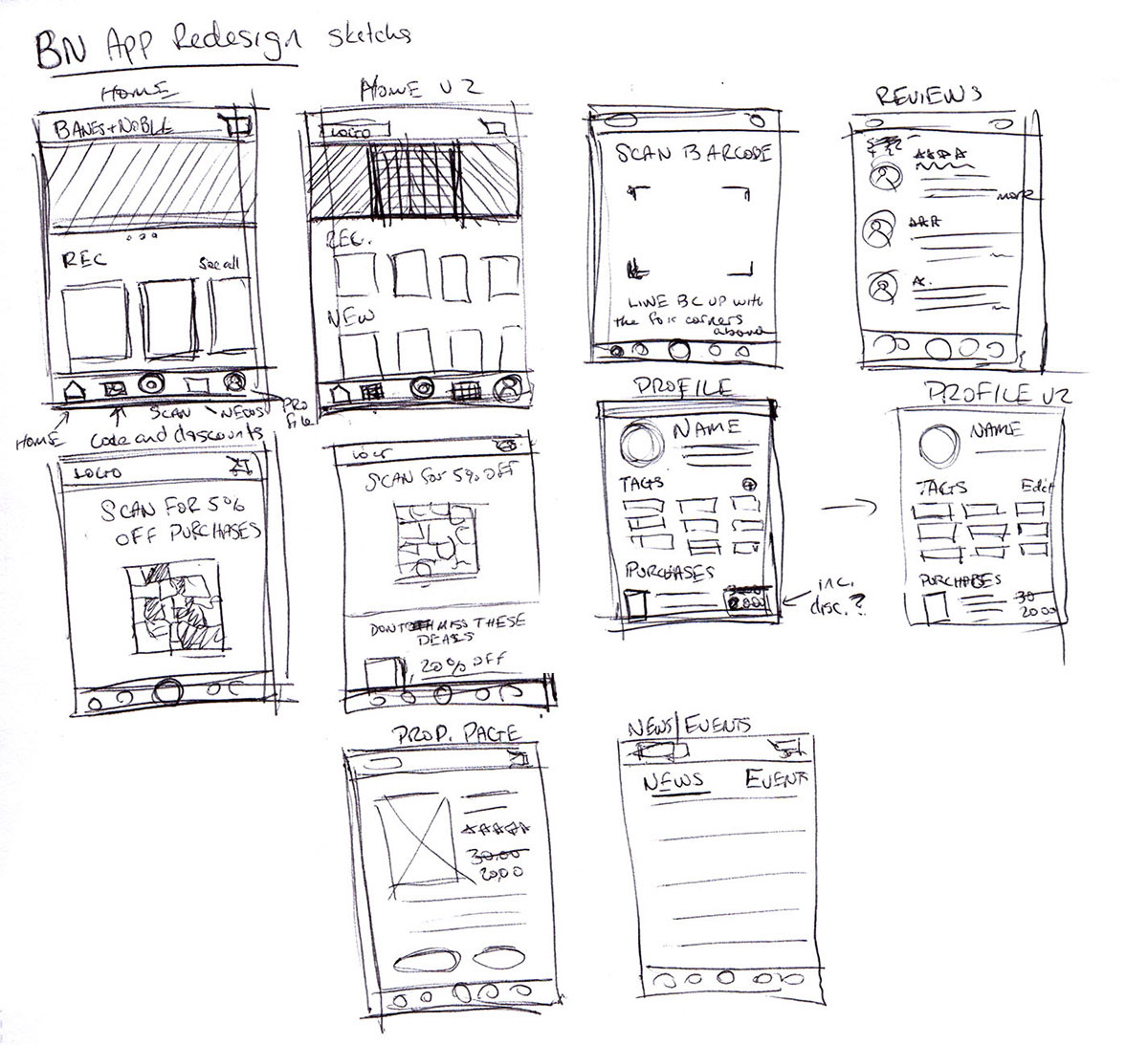
Following that was the first of two sets of wireframes where the layout of each page and iconography became more developed.
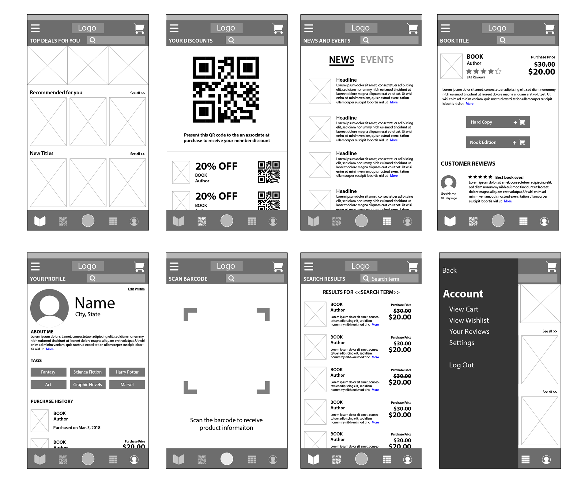
The second set of wireframes refined some of the iconography further (i.e. the barcode scanner went from a lense to something that more literally communicates "barcode scan"). This iteration also saw the elimination of the hamburger menu in favor of a layout that didn't require one since all of the apps features could be accessed in the top and bottom navigation.
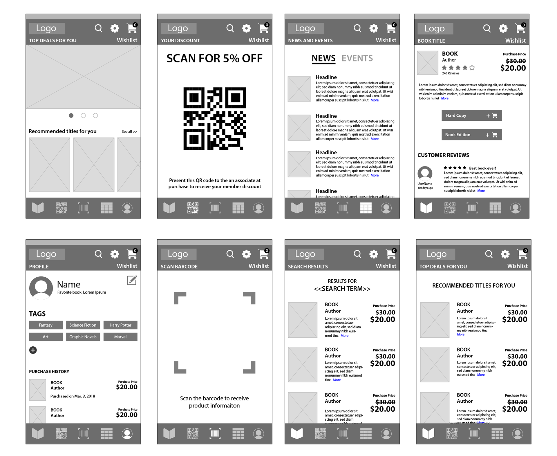
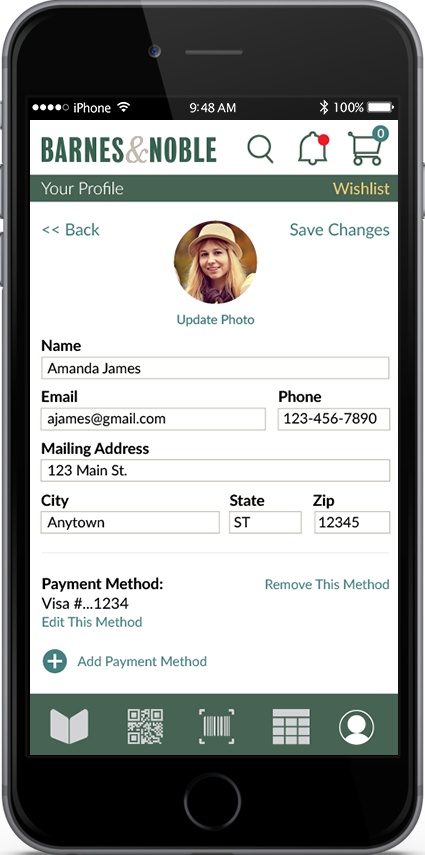
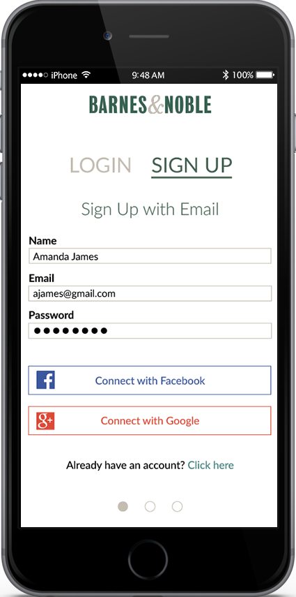
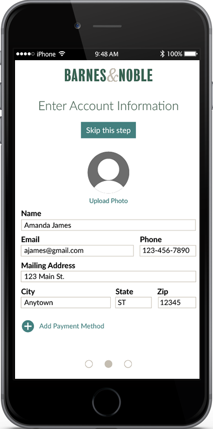
Finally, hi-fidelity wireframes were developed for each of the user flows expected to be used.
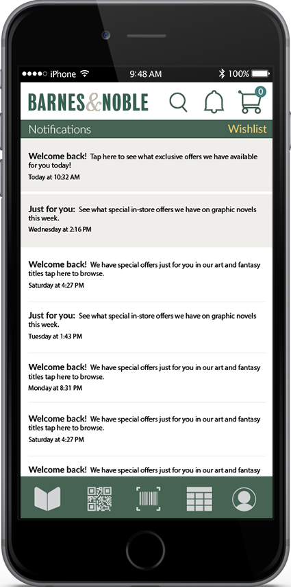
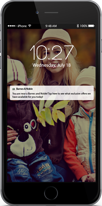
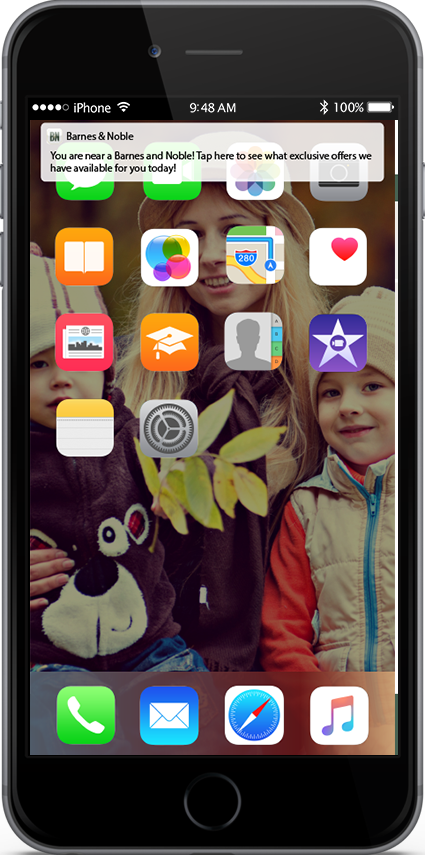
Other features include how the user is notified to take advantage of the app.
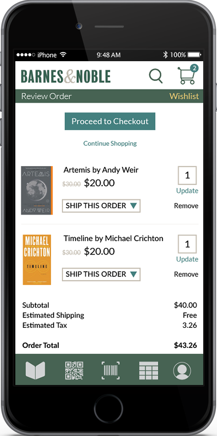
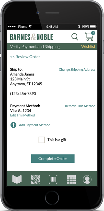
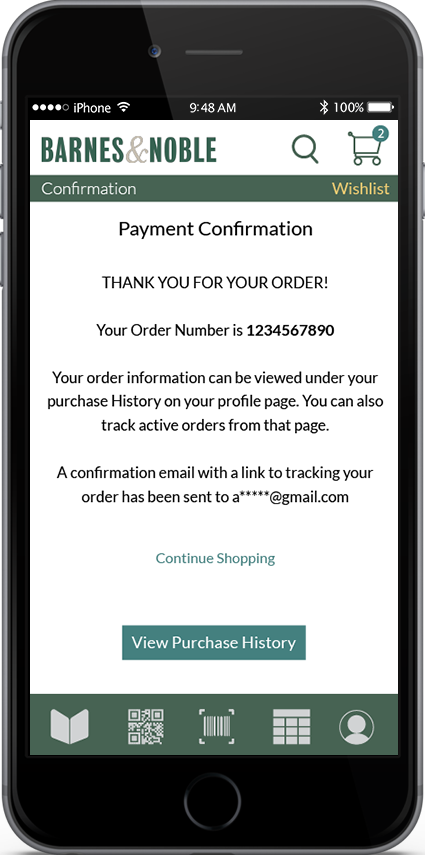
The purchase flow aims to require as few taps as possible by using already stored information on the user.

The purchase flow aims to require as few taps as possible by using already stored information on the user.
Future considerations for this project include extensive usability testing to observe the user's reaction to the app's features, meaning how well they would understand and use them. Following this would be continued iteration of the design based on these results.
Thanks for taking a look at this project!